Colors and the child's psyche - Montessori's approach to colors in the environment
PKolors, śshelterło and mutual relationshipązki pomiębetween them playą to¶ relevanceą rollę w our daily żlife, of which not always śwe are aware ofę. Yet from one roomń we want to come out¶ as soon as possible, in other chętnie we stay on dłużej. Chooseąc vacation destination, we take into accountę colors in photoęciach, whichóre present themą. Colors and the child's psyche - so what is the Montessori approach to colors in the environment? Herbń The trees, the turquoise of the sea, bile sand, red roofs of housesów-right, żThat it works on usła?
Colors and the child's psyche, or how do colors affect the child's psyche?
Colors affect our emotions, concentration and mood. Montessori is very much about creating space around the child, and this of course applies to colors as well. After all, the main task of the teacher is to take care of the so-called prepared environment. The prepared environment is the child's key teacher, he learns mainly by operating in that environment. The right choice of colors definitely helps to create a harmonious space conducive to learning, development and relaxation. Let's consider how particular colors affect the well-being of the child and accompanying adults, and check out what Maria Montessori wrote on the subject.
There are many indications that children perceive colors more intensely than adults. Our color vision deteriorates with age, the lenses of our eyes turn yellow, we begin to see the world as if through a dirty glass. Children, for the most part, do not have this problem. Colors have an intensifying effect on them, and it can be stimulating or calming. The appropriate use of colors in a child's environment can promote sensory and cognitive development.
It is worth remembering the basics:
- Bright, intense colors can over-stimulate and lead to overstimulation.
- Subdued colors They help with concentration and tranquility.
- Contrasting color combinations Support learning and visual perception.
Colors vs Montessori approach - minimalism and harmony
Montessori emphasizes an orderly, harmonious environment that promotes a child's natural development. Too many intense colors can lead to chaos and distraction. Therefore, Montessori space is governed by several laws:
- Avoid excessively bright colors.
- Using natural, muted shades inspired by nature.
- Selecting colors in development materials so that contrasts help learning but do not create over-stimulation.
- Keeping an eye on the isolation of difficulties in materials (if we differentiate color, no longer size or texture, etc.).
The importance of individual colors in child development
Calming and conducive to concentration
- Blue - has a relaxing effect, promotes concentration and helps with learning.
- Green - It is associated with nature, brings harmony and helps in tranquility.
- Beiges and pastels - They create a warm, friendly environment, promote relaxation.
Stimulating and encouraging development
- Yellow - It stimulates the mind and is associated with joy and creativity.
- Orange - fosters communication, openness and has an energizing effect. It is the color of our logo and the guiding color of our Instagram!
- Red - stimulates, but in excess can cause anxiety - it is worth using in moderation.
Neutral colors - how to use them in a Montessori setting?
White and gray backgrounds as a base for more expressive elements.
Natural wood tones that fit in with the Montessori philosophy and promote sustainable development.
How to consciously choose colors in a child's space according to Montessori philosophy?
Practical tips for arranging a child's space at home, Montessori nursery or playroom:
- Creating balance Between subdued and intense colors, the predominance of the former
- Use of colors according to spatial functionand (e.g., warm colors in the play area, cooler colors in the rest area).
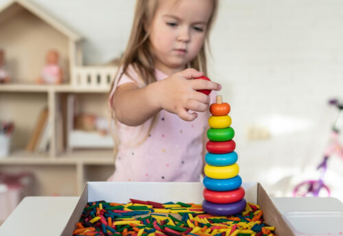
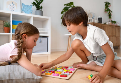
- Using color in education - For example, colorful puzzles, sensory materials, but in moderation and avoiding visual chaos.
Aesthetics and colors in a child's environment - what does Maria Montessori say about it?
Maria Montessori placed great emphasis on preparing the environment so that it would promote the development and well-being of the child. She stressed the importance of beauty and harmony - in her opinion, „the child must live in an environment of beauty.” Therefore, Montessori pedagogy attaches great importance to the aesthetics of space and makes sure there is no excess of stimuli. According to the principle of Montessori aesthetics, the colors of the walls, floor and background should be subdued and neutral, making it easier for the child to focus attention on what is important.
Yes, Maria Montessori was a minimalist before it was fashionable! So if you walk into an establishment and see clutter, chaos, piles of toys, assorted Winnie the Poohs and Disneys on the walls, carpets in motley patterns and cabinets in all the colors of the rainbow, you can already be sure that this is not a Montessori school or preschool, even if it uses the slogan „Montessori elements” in its marketing.
According to Maria Montessori, the environment is to be simple, orderly and beautiful, but not dull, austere, cold or fully ascetic. Such controlled simplicity, warmed by colorful accents, makes the environment calm and clear, which promotes polarized attention in children. Montessori also noted that eliminating unnecessary, chaotic elements helps children focus: „interest and concentration are born directly from the removal of what is confusing and unnecessary”.”.
The influence of colors on child development - the views of Maria Montessori
Montessori observed that colors have a strong effect on a child's attention and interest. She wrote that certain elements of the environment even „call out” to toddlers and provoke them to action. „The dazzling colors and beauty of the richly decorated objects are nothing more than «voices» that attract a child's attention and encourage them to act.” - stated Montessori. The child, following this invitation from the attractive material, feels joy and an „awakening of energy,” which prepares him for more demanding intellectual tasks. The beautiful colors and aesthetics of the educational materials awaken the child's desire for action, making it easier to enter a state of deep concentration and learning.
That's why we collect in our halls not only classically beautiful, solidly made aids made of natural materials, but also passionately collect beautiful objects - figurines, sculptures, trays, napkins, candlesticks... All this affects children and fills their souls and hearts with beauty, goodness, harmony.
Dr. Montessori treated colors not just as decoration, but as part of a scientific approach to sensory education. As part of her sensory materials, for example, she created sets of color plates for learning to distinguish colors. She started with basic colors to introduce the child to the world of colors using a gradual method: „The child has seen many colors in the environment, but we present him with three primary colors as a guide to scientific color observation.”. These three elementary colors (red, yellow, blue) are the starting point. With them, the child first learns to distinguish and name the primary colors, and only then the subsequent shades. Such an orderly introduction to the world of colors allows to develop the sense of sight and the ability to classify sensations, which is important for the intellectual development of the toddler. Sets of color plates are still a staple of our Sensory Education departments and some of the children's beloved materials. Working with them is a real delight for the eyes and hands.
Functional use of colors in Montessori materials
In Montessori developmental materials, color always serves a specific purpose. One important principle is the principle of isolating difficulties - each material is supposed to isolate one feature for learning, so that the child can focus on a specific property. Therefore, the number of variables is limited, including using a uniform color for the elements of a given material or a distinctive color for the entire set. As put in the Montessori concept: „only one feature; if [we teach] length, for example, [the elements are] only one color.”
Montessori selected the colors of the various aids based on her experience and observation of the children's work. She mentioned that she changed the materials through trial and error, guided by how the children reacted to them: „Children's reactions to various objects, the way and frequency of their use, and the benefits they derived from them, gradually provided some criteria for eliminating, modifying and accepting the aids used in our schools. Everything about these objects - color, size, shape and so on - has been determined by experience.”.
The colors of the developmental materials were chosen empirically - Montessori observed which colors best served educational purposes and engaged children the most.
As a result, each classic Montessori material has a thoughtful color scheme. For example, the red beams are all red so that the child pays attention only to their length (they differ only in length). The brown stairs have a natural wood-brown color and differ in two dimensions (height and width). The pink tower, on the other hand, consists of cubes that differ in three dimensions (size - from 1 cm³ to 1000 cm³).
This allows the child to practice a particular sense or concept in isolation - for example, in the case of the pink tower, the focus is solely on the gradation of size, because all the blocks have the same shape, texture and color.
The Pink Tower - why pink in particular?
The Pink Tower is one of the most recognizable Montessori materials - a set of ten wooden cubes growing gradually from the smallest to the largest. Their equal color has a purely functional premise: by eliminating color differences, we isolate one difficulty, that of comparing sizes. Montessori wanted the child to focus on the size of the blocks, not on their colors or decorations. That's why it's not indifferent whether a young child gets a pink tower to play with or the mottled picture cubes offered en masse on the market.
Maria Montessori might as well have chosen a different color for her pink tower. That's why the question is often asked: why pink? It turns out that it was no coincidence.
Maria Montessori experimented with different colors of the tower and closely observed the children as they worked. She noted that the toddlers were most eager to just reach for the pink-colored cubbies - it attracted their attention most effectively. As the Montessori tradition describes, it was the children who, with their choice, prompted her to find the right solution. Pink turned out to be the color most attractive to the little ones, so it was this shade that became the hallmark of the famous tower.
Dr. Montessori was faithful to her scientific method - since observation showed the effectiveness of pink, she adopted it permanently. As a result, the Pink Tower not only teaches the concept of size and gradation, but also has been pleasing children's eyes for more than a century with its beautiful, soft color that encourages them to play and learn spontaneously.
Colors and the child's psyche - summary
Kolory mają realny wpływ na psychikę dziecka, dlatego warto świadomie je dobierać. Montessori zaleca harmonię, naturalność i prostotę, aby stworzyć przestrzeń, która sprzyja spokojowi, koncentracji i rozwijaniu zainteresowań dziecka. Unikajmy nadmiaru bodźców i chaosu kolorystycznego, skupiając się na barwach wspierających rozwój emocjonalny oraz poznawczy naszych dzieci. I wybierajmy dla naszych dzieci takie placówki edukacyjne, za którymi stoi ugruntowana wiedza naukowa na temat mechanizmów funkcjonowania i uczenia się dzieci. Takie, które wiedzą, co robią, i dlaczego.